plain.admin
Manage your app with a backend interface.
- Overview
- Admin viewsets
- Links
- Admin cards
- Admin forms
- List filters
- Actions
- Toolbar
- Impersonate
- Customization
- Access control
- FAQs
- Installation
Overview
The Plain Admin provides a combination of built-in views and the flexibility to create your own. You can use it to quickly get visibility into your app's data and to manage it.
The most common use of the admin is to manage your plain.postgres. To do this, create a viewset with inner/nested views:
# app/users/admin.py
from plain.admin.views import (
    AdminModelDetailView,
    AdminModelListView,
    AdminModelUpdateView,
    AdminViewset,
    register_viewset,
)
from plain.postgres.forms import ModelForm

from .models import User


class UserForm(ModelForm):
    class Meta:
        model = User
        fields = ["email"]


@register_viewset
class UserAdmin(AdminViewset):
    class ListView(AdminModelListView):
        model = User
        fields = [
            "id",
            "email",
            "created_at__date",
        ]
        queryset_order = ["-created_at"]
        search_fields = [
            "email",
        ]

    class DetailView(AdminModelDetailView):
        model = User

    class UpdateView(AdminModelUpdateView):
        template_name = "admin/users/user_form.html"
        model = User
        form_class = UserForm
Admin viewsets
The AdminViewset automatically recognizes inner views named ListView, CreateView, DetailView, UpdateView, and DeleteView. It interlinks these views automatically in the UI and sets up form success URLs. You can define additional views too, but you will need to implement a couple methods to hook them up.
Model views
For working with database models, use the model-specific view classes. These handle common patterns like automatic URL paths, queryset ordering, and search.
AdminModelListView- Lists model instances with pagination, search, and sortingAdminModelDetailView- Shows a single model instance with all its fieldsAdminModelCreateView- Creates new model instances using a formAdminModelUpdateView- Updates existing model instancesAdminModelDeleteView- Deletes model instances with confirmation
@register_viewset
class ProductAdmin(AdminViewset):
    class ListView(AdminModelListView):
        model = Product
        fields = ["id", "name", "price", "created_at"]
        queryset_order = ["-created_at"]
        search_fields = ["name", "description"]

    class DetailView(AdminModelDetailView):
        model = Product
        fields = ["id", "name", "description", "price", "created_at", "updated_at"]

    class CreateView(AdminModelCreateView):
        model = Product
        form_class = ProductForm

    class UpdateView(AdminModelUpdateView):
        model = Product
        form_class = ProductForm

    class DeleteView(AdminModelDeleteView):
        model = Product
The fields attribute on list and detail views supports the __ syntax for accessing related objects and calling methods. For example, "created_at__date" will call the date() method on the datetime field.
Object views
For working with non-model data (API responses, files, etc.), use the base object views. These require you to implement get_initial_objects() or get_object() methods.
AdminListView- Base list view for any iterableAdminDetailView- Base detail view for any objectAdminCreateView- Base create viewAdminUpdateView- Base update viewAdminDeleteView- Base delete view
from plain.admin.views import AdminListView, AdminViewset, register_viewset


@register_viewset
class ExternalAPIAdmin(AdminViewset):
    class ListView(AdminListView):
        title = "External Items"
        nav_section = "Integrations"
        path = "external-items/"
        fields = ["id", "name", "status"]

        def get_initial_objects(self):
            # Fetch from an external API, file, or any data source
            return external_api.get_items()
Navigation
Views appear in the admin sidebar based on their nav_section and nav_title attributes. Set nav_section to group related views together.
class ListView(AdminModelListView):
    model = Order
    nav_section = "Sales"  # Groups this view under "Sales" in the sidebar
    nav_title = "Orders"   # Display name (defaults to model name)
    nav_icon = "shopping-cart"  # Icon for the section
Icons come from Bootstrap Icons. To search available icon names:
uv run plain admin icons         # List all ~2,078 icons
uv run plain admin icons cart    # Search by keyword
Setting nav_section = None hides a view from the navigation entirely.
Links
Admin views can display action links in their title bar. There are two types: links appear as visible buttons, while extra links are tucked into a three-dots overflow dropdown.
On mobile, both link types are combined into a single dropdown menu.
from plain.urls import reverse


@register_viewset
class OrderAdmin(AdminViewset):
    class ListView(AdminModelListView):
        model = Order

        def get_extra_links(self):
            extra_links = super().get_extra_links()
            extra_links["Import"] = reverse("orders:import")
            return extra_links

    class DetailView(AdminModelDetailView):
        model = Order

        def get_extra_links(self):
            extra_links = super().get_extra_links()
            extra_links["Export PDF"] = reverse("orders:export", pk=self.object.pk)
            return extra_links
Viewsets already populate links automatically — list views get a "New" link if a CreateView exists, and detail views get "Edit" and "Delete" links for their respective views. Use get_extra_links() for additional actions that don't need primary button visibility.
Admin cards
Cards display summary information on admin pages. You can add them to any view by setting the cards attribute.
Basic cards
The base Card class displays a simple card with a title, optional description, metric, text, and link. When both a metric and link are provided, the metric itself becomes a clickable link.
from plain.admin.cards import Card
from plain.admin.views import AdminView, register_view


class UsersCard(Card):
    title = "Total Users"
    size = Card.Sizes.SMALL

    def get_metric(self):
        from app.users.models import User
        return User.query.count()

    def get_link(self):
        return "/admin/p/user/"


@register_view
class DashboardView(AdminView):
    title = "Dashboard"
    path = "dashboard/"
    nav_section = ""
    cards = [UsersCard]
Card sizes control how much horizontal space they occupy in a four-column grid:
Card.Sizes.SMALL- 1 column (default)Card.Sizes.MEDIUM- 2 columnsCard.Sizes.LARGE- 3 columnsCard.Sizes.FULL- 4 columns (full width)
Trend cards
The TrendCard displays a bar chart showing data over time. It works with models that have a datetime field.
from plain.admin.cards import TrendCard
from plain.admin.dates import DatetimeRangeAliases


class SignupsTrendCard(TrendCard):
    title = "User Signups"
    size = TrendCard.Sizes.MEDIUM
    model = User
    datetime_field = "created_at"
    default_preset = DatetimeRangeAliases.SINCE_30_DAYS_AGO
Trend cards include built-in date range presets like "Today", "This Week", "Last 30 Days", etc. Users can switch between presets in the UI.
For custom chart data, override the get_trend_data() method to return a dict mapping date strings to counts.
Table cards
The TableCard displays tabular data with headers, rows, and optional footers.
from plain.admin.cards import TableCard


class RecentOrdersCard(TableCard):
    title = "Recent Orders"
    size = TableCard.Sizes.FULL  # Tables typically use full width

    def get_headers(self):
        return ["Order ID", "Customer", "Total", "Status"]

    def get_rows(self):
        orders = Order.query.order_by("-created_at")[:5]
        return [
            [order.id, order.customer.name, order.total, order.status]
            for order in orders
        ]
Key/value cards
The KeyValueCard displays a list of label/value pairs as a definition list. Useful for short metric- or identity-style data (server stats, version info, account summaries) where the values are pre-formatted strings.
from plain.admin.cards import KeyValueCard


class ServerCard(KeyValueCard):
    title = "Server"
    size = KeyValueCard.Sizes.MEDIUM

    def get_items(self):
        return {
            "Version": "1.2.3",
            "Uptime": "3d 4h",
            "Region": "us-east",
        }
For a single object's full field set, use a model detail view instead — it dispatches each value through a per-type renderer.
Admin forms
Admin forms work with standard plain.forms. For model-based forms, use ModelForm.
from plain.postgres.forms import ModelForm
from plain.admin.views import AdminModelUpdateView


class UserForm(ModelForm):
    class Meta:
        model = User
        fields = ["email", "first_name", "last_name", "is_active"]


class UpdateView(AdminModelUpdateView):
    model = User
    form_class = UserForm
    template_name = "admin/users/user_form.html"  # Optional custom template
The form template extends the admin base and renders fields with the admin's Plain elements:
{% extends "admin/base.html" %}
{% use_elements %}

{% block content %}
<form method="post" class="space-y-4">
    <admin.InputField label="Email" field={form.email} />
    <admin.InputField label="First name" field={form.first_name} />
    <admin.InputField label="Last name" field={form.last_name} />
    <admin.CheckboxField label="Active" field={form.is_active} />

    <admin.Submit>Save</admin.Submit>
</form>
{% endblock %}
CSRF is automatic (no {{ csrf_input }} needed). Plain forms are headless — there's no as_p() / as_table(); you compose the markup yourself with the elements above.
Elements
The admin ships these Plain elements for building admin templates. Paired field elements (label + input + help + errors) cover the common case; unwrapped primitives are there when you need custom layouts.
| Element | Renders |
|---|---|
<admin.Submit> |
Right-aligned <button> with admin-btn admin-btn-primary styling |
<admin.InputField> |
<admin.Label> + <admin.Input> + <admin.Help> + <admin.FieldErrors> |
<admin.CheckboxField> |
<admin.Checkbox> + <admin.Label> + <admin.Help> + <admin.FieldErrors> |
<admin.SelectField> |
<admin.Label> + <admin.Select> + <admin.Help> + <admin.FieldErrors> |
<admin.TextareaField> |
<admin.Label> + <admin.Textarea> + <admin.Help> + <admin.FieldErrors> |
<admin.Input> |
<input class="admin-input">; pass type="email" etc. via the type prop |
<admin.Checkbox> |
<input type="checkbox" class="admin-input"> |
<admin.Select> |
<select class="admin-select"> with <option>s from field.field.choices |
<admin.Textarea> |
<textarea class="admin-textarea"> (set rows via prop) |
<admin.Label> |
<label class="admin-label"> with required * indicator |
<admin.Help> |
<p class="text-admin-muted-foreground"> of help text |
<admin.FieldErrors> |
Error messages with danger icon |
<admin.SearchInput> |
<input class="admin-input pl-8"> with a leading search-icon overlay (used in list filters / topbar) |
<admin.Icon> |
<i class="bi bi-{name}"> — pass name="plus-lg" etc. (full set: bootstrap-icons) |
Source: templates/elements/admin/ — read the file directly to see exactly what each element accepts.
List filters
On AdminListView and AdminModelListView, you can define different filters to build predefined views of your data. The filter choices will be shown in a dropdown in the UI.
Declarative filters
On AdminModelListView, filters can be defined as a dict[str, Q] mapping filter names to Q objects. The framework handles the queryset filtering automatically.
from plain.postgres import Q

@register_viewset
class UserAdmin(AdminViewset):
    class ListView(AdminModelListView):
        model = User
        fields = ["id", "email", "created_at__date"]
        filters = {
            "Active": Q(is_active=True),
            "Inactive": Q(is_active=False),
            "Staff": Q(is_staff=True),
        }
Use prefixed names to organize filters that span multiple dimensions:
filters = {
    "Host: GitHub": Q(host_type="GITHUB"),
    "Host: GitLab": Q(host_type="GITLAB"),
    "Mode: Active": Q(mode="ACTIVE"),
    "Mode: Disabled": Q(mode="DISABLED"),
}
Custom filters
For filters that need custom logic (e.g., annotations), use a list[str] and override filter_queryset:
@register_viewset
class UserAdmin(AdminViewset):
    class ListView(AdminModelListView):
        model = User
        fields = ["id", "email", "created_at__date"]
        filters = ["Active users", "Inactive users"]

        def filter_queryset(self, queryset):
            if self.filter == "Active users":
                return queryset.filter(is_active=True)
            elif self.filter == "Inactive users":
                return queryset.filter(is_active=False)
            return queryset
Actions
List views support bulk actions on selected items. Define actions as a list of action names, then implement perform_action() to handle them.
class ListView(AdminModelListView):
    model = User
    fields = ["id", "email", "is_active"]
    actions = ["Activate", "Deactivate", "Delete selected"]

    def perform_action(self, action, target_ids):
        users = User.query.filter(id__in=target_ids)

        if action == "Activate":
            users.update(is_active=True)
        elif action == "Deactivate":
            users.update(is_active=False)
        elif action == "Delete selected":
            users.delete()

        # Return None to redirect back to the list, or return a Response
        return None
The target_ids parameter contains the IDs of selected items. Users can select individual items or use "Select all" to target the entire filtered queryset.
Toolbar
The admin includes a toolbar component that appears on your frontend when an admin user is logged in. This toolbar provides quick access to the admin and shows a link to edit the current object if one is detected.
The toolbar is registered automatically when you include plain.admin in your installed packages. It uses plain.toolbar to render on your pages.
To enable the toolbar on your frontend, add the toolbar middleware and include the toolbar template tag in your base template:
# app/settings.py
MIDDLEWARE = [
    # ...other middleware
    "plain.toolbar.ToolbarMiddleware",
]
<!-- In your base template -->
{% load toolbar %}
{% toolbar %}
When viewing a page that has an object in the template context, the toolbar will show a link to that object's admin detail page (if one exists).
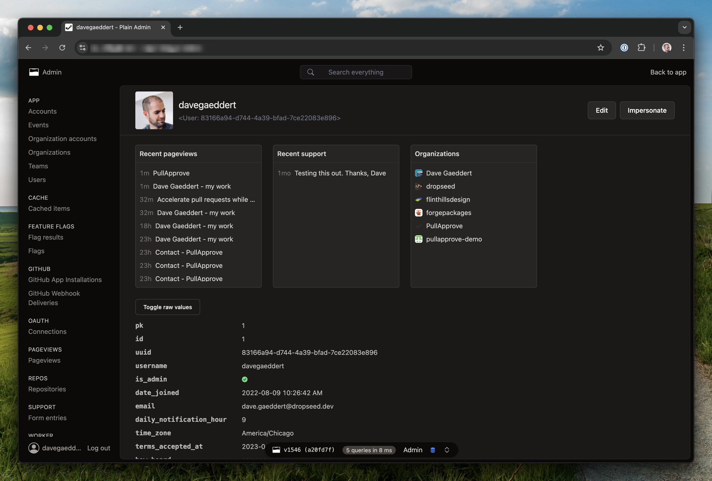
Impersonate
The impersonate feature lets admin users log in as another user to debug issues or provide support. This is useful for seeing exactly what a user sees without needing their credentials.
To start impersonating, visit a user's detail page in the admin and click the "Impersonate" link. The admin toolbar will show who you're impersonating and provide a link to stop.
By default, users with is_admin=True can impersonate other users. Admin users cannot be impersonated (for security). You can customize who can impersonate by defining IMPERSONATE_ALLOWED in your settings:
# app/settings.py
def IMPERSONATE_ALLOWED(user):
    # Only superusers can impersonate
    return user.is_superuser
The impersonate URLs are included automatically with the admin router. You can check if the current request is impersonated using get_request_impersonator:
from plain.admin.impersonate import get_request_impersonator

def my_view(request):
    impersonator = get_request_impersonator(request)
    if impersonator:
        # The request is being impersonated
        # `impersonator` is the admin user doing the impersonating
        # `request.user` is the user being impersonated
        pass
Customization
Theming
The admin's UI is built on a per-component CSS layer with Plain's brand
palette layered on top. Every color, radius, and chrome surface is a CSS
custom property declared on .plain-admin (light) and
.dark.plain-admin, .dark .plain-admin (dark) — redeclare any token in
your own stylesheet to retheme the admin without forking templates.
The cleanest place for overrides is your project's Tailwind input file
(typically tailwind.css at the repo root), since plain.tailwind
auto-discovers plain.admin's tailwind.css and compiles its tokens
into the same bundle. Anything you add after that import wins:
/* tailwind.css */
@import "tailwindcss";
@import "./.plain/tailwind.css";

.plain-admin {
  --primary: #4f46e5;             /* drives .admin-btn-primary, focus rings, active tab */
  --primary-foreground: white;
  --ring: #4f46e5;
  --header-bg: #eef2ff;           /* sticky top header surface */
  --link: #4f46e5;
  --link-hover: #3730a3;
}
.dark.plain-admin,
.dark .plain-admin {
  --primary: #818cf8;
  --primary-foreground: #1e1b4b;
  --ring: #818cf8;
  --header-bg: oklch(0.22 0.05 270);
  --link: #c7d2fe;
  --link-hover: #e0e7ff;
}
Match the source selectors so specificity ties — a bare :root { --primary: ... }
will be beaten by the admin's own .plain-admin declarations and won't take
effect.
The most commonly retuned tokens:
- Brand palette —
--primary,--primary-foreground,--ring,--link,--link-hover,--header-bg. - Status family —
--success,--warning,--danger,--info, each with a*-foregroundfor legible text on solid fills (used by.admin-btn-danger,.admin-alert-warning, etc.). - Chart palette —
--chart-1through--chart-5, used byTrendCardand any other chart in the admin. - Radius — every component has its own
--radius-*token (--radius-card,--radius-button,--radius-input,--radius-dialog, …). Override one to retune just that component, or override--radius(the master) to shift every default proportionally. Genericrounded-admin-sm/-md/-lgutilities remain for ad-hoc template use. - Surfaces —
--background,--card,--muted,--accent,--popover, plus their*-foregroundpairs.
The full list of tokens with side-by-side swatches is rendered live at
/admin/ui/ — visit it in your own running admin
to see every token, every component variant, and copy-pasteable markup.
The admin ships with light and dark mode out of the box. A toggle in the top
bar cycles Light → Dark → System, persisted in localStorage. The dark
class is applied to <html> before paint via an inline init script, so there
is no flash of the wrong theme on page load.
To force the admin to a single appearance, set ADMIN_FORCE_THEME to
"light" or "dark" (default None keeps the per-user toggle). Useful
when you've only customized tokens for one mode, or want every screenshot
and shared link to look the same. When forced, the toggle is hidden and
the <html> class is rendered server-side.
# app/settings.py
ADMIN_FORCE_THEME = "dark"
You can also set it via the PLAIN_ADMIN_FORCE_THEME environment variable.
Beyond tokens
When a token swap doesn't cover what you need, override the .admin-*
classes directly — in the same stylesheet you put token overrides in:
/* tailwind.css */
.admin-card {
  border-width: 2px;
  box-shadow: 0 1px 0 var(--border) inset;
}

.admin-btn-primary {
  text-transform: uppercase;
  letter-spacing: 0.04em;
}
The classes shown in the catalog are a stable surface, and
the admin's component rules live in @layer components — unlayered
declarations in your stylesheet beat them automatically. No specificity
gymnastics needed.
Forking templates remains as an escape hatch (FAQ) but should be the last resort: you take on keeping the fork in sync as the admin evolves.
Fonts
The admin ships Inter (sans) and
JetBrains Mono (mono), vendored
under plain.admin's assets and licensed under the SIL Open Font License 1.1.
Their @font-face declarations live in an overridable admin_fonts block
of admin/_base.html; the defaults of --font-sans and --font-mono lead
with these families and fall back to the system stack.
Three override patterns:
/* 1. Use the bundled fonts but lean on the system stack as the
      primary — Inter / JetBrains Mono still load. */
.plain-admin {
  --font-sans: ui-sans-serif, system-ui, sans-serif;
}
{# 2. Replace the bundled fonts with your own.
   In app/templates/admin/base.html: #}
{% extends "admin/_base.html" %}
{% block admin_fonts %}
<style nonce="{{ request.csp_nonce }}">
@font-face {
  font-family: "Geist";
  src: url("{{ asset('fonts/Geist.woff2') }}") format("woff2");
}
</style>
{% endblock %}
{# 3. Drop the bundled fonts entirely and use the system stack. #}
{% block admin_fonts %}{% endblock %}
Pair (2) and (3) with a --font-sans / --font-mono override on .plain-admin
so the cascade actually picks up the new family.
Components
The admin includes a live component catalog at /admin/ui/.
Each section shows the rendered component with copy-pasteable markup —
buttons, badges, alerts, cards, form fields, dialogs, dropdowns, tabs,
tables, and icons. Use these classes when building admin views and
you'll inherit both light/dark theming and the user's brand overrides.
The catalog page is rendered from
templates/admin/ui.html — read that file
directly for copy-pasteable markup if you can't open the running admin
(e.g. when an agent is generating templates). The canonical class list
lives one file per primitive in
styles/components/.
| Pattern | Class(es) |
|---|---|
| Buttons | Compose .admin-btn with one of .admin-btn-primary / .admin-btn-secondary / .admin-btn-outline / .admin-btn-ghost / .admin-btn-link |
| Sizes / icon-only | Stack .admin-btn-sm or .admin-btn-lg; add .admin-btn-icon for a square icon-only button (e.g. class="admin-btn admin-btn-sm admin-btn-icon admin-btn-ghost") |
| Status buttons | .admin-btn-success, .admin-btn-warning, .admin-btn-danger, .admin-btn-info (solid fill + paired fg) |
| Badges | Compose .admin-badge with one of .admin-badge-primary / .admin-badge-secondary / .admin-badge-outline |
| Status badges | Stack .admin-badge-success, .admin-badge-warning, .admin-badge-danger, .admin-badge-info (translucent fill + saturated text) |
| Alerts | Compose .admin-alert (neutral surface) with .admin-alert-success / .admin-alert-warning / .admin-alert-danger / .admin-alert-info for tone |
| Cards | .admin-card — visual shell only (bg + border + radius); compose layout/padding inline (e.g. class="admin-card flex flex-col gap-6 p-6") |
| Form inputs | .admin-input, .admin-textarea, .admin-select — opt in via class; pair with -sm for compact rows |
| Dialogs | <dialog class="admin-dialog"> opened via <button command="show-modal" commandfor="…"> |
| Tabs | .admin-tabs > [role="tablist"] > [role="tab"] (uses tabs.js) |
| Dropdowns | .admin-dropdown-menu wrapping a <button> + sibling [data-popover] (carries popover="manual", opens in the top layer so it's never clipped by a table/overflow box) with [role="menu"] |
When writing custom admin templates, prefer the design tokens over hardcoded colors so dark mode and theme overrides work automatically:
| Use | Class / token |
|---|---|
| Page background | bg-admin-background, text-admin-foreground |
| Cards / panels | bg-admin-card text-admin-card-foreground |
| Subtle surfaces | bg-admin-muted, bg-admin-muted/40 |
| Hover surface | hover:bg-admin-accent hover:text-admin-accent-foreground |
| Borders | border-admin-border (general), border-admin-input (form fields) |
| Muted text | text-admin-muted-foreground |
| Primary action | bg-admin-primary / text-admin-primary-foreground |
| Link | text-admin-link hover:text-admin-link-hover |
| Status text | text-admin-success, text-admin-warning, text-admin-danger, text-admin-info |
| Status backgrounds | bg-admin-success/10, bg-admin-warning/10, bg-admin-danger/10, bg-admin-info/10 (translucent fills, used by status badges) |
| Status solid action | bg-{success,warning,danger,info} / text-{name}-foreground |
| Focus ring | ring-admin-ring |
| Header surface | bg-admin-header-bg |
The component CSS source lives in
plain/admin/styles/: tokens.css declares every design
token (light + dark) and the @theme bindings, components/*.css holds
one file per UI primitive, and tailwind.css (next to the package's
__init__.py) is the entry that plain.tailwind auto-imports into the
user's build.
Header branding
The top-left corner of the admin header shows your app name and an "Admin" link by default. To replace it with your own logo or branding, create an admin/header_branding.html template:
<!-- app/templates/admin/header_branding.html -->
<a href="/">
    <img src="{{ asset('img/logo.svg') }}" alt="My App" class="h-5">
</a>
The template completely replaces the default branding, so include whatever links and styling you want.
User avatar
The admin header shows a user avatar next to the account dropdown. If your User model defines a get_avatar_url() method, the admin will use it to display an image. Otherwise, a generic person icon is shown.
# app/users/models.py
import hashlib
from plain import postgres
from plain.postgres import types


@postgres.register_model
class User(postgres.Model):
    email: str = types.EmailField()

    def get_avatar_url(self) -> str:
        # Use Gravatar
        email_hash = hashlib.md5(self.email.lower().encode("utf-8")).hexdigest()
        return f"https://www.gravatar.com/avatar/{email_hash}?d=identicon"
The method can return any image URL — a Gravatar, an uploaded file, or a data URI SVG.
User menu items
To add items to the user dropdown menu (e.g., a profile page), create an admin/user_menu_items.html template in your app:
<!-- app/templates/admin/user_menu_items.html -->
<a
    href="{{ admin_url('profile') }}"
    class="flex items-center gap-2 w-full text-left px-4 py-2 text-sm text-admin-popover-foreground hover:bg-admin-accent hover:text-admin-accent-foreground rounded"
>
    Profile
</a>
The admin_url() function resolves a view URL by its path attribute. For example, a view with path = "profile" is resolved by admin_url("profile").
The template is included in the user dropdown before the "App Settings" and "Log out" links. If the template doesn't exist, nothing extra is shown.
Field value templates
The admin resolves a template for each field value in list and detail views. Templates are checked in priority order — the first one that exists wins:
- Field name —
admin/values/{field_name}.html(e.g.,admin/values/access_token.html) - Database field type —
admin/values/{FieldClass}.html(e.g.,admin/values/EncryptedTextField.html) - Python value type —
admin/values/{type}.html(e.g.,admin/values/bool.html) - Default —
admin/values/default.html
To customize how a field type renders, create a template matching the field class name. For example, EncryptedTextField and EncryptedJSONField are automatically masked with click-to-reveal using their built-in templates.
Access control
By default, any user with is_admin=True can access all admin views. To restrict specific views from certain admin users, use has_permission.
Per-view restriction
Override has_permission on a view class to control who can access it. Return False to deny access.
@register_viewset
class SensitiveDataAdmin(AdminViewset):
    class ListView(AdminModelListView):
        model = SensitiveData
        nav_section = "Internal"

        @classmethod
        def has_permission(cls, user) -> bool:
            # Only superusers can access this view
            return user.is_superuser
When a user is denied access to a view, they get a 403 response and the view is hidden from their navigation.
Global restriction
To control access across all admin views (including package-shipped ones you don't own), set ADMIN_HAS_PERMISSION in your settings to a callable that receives the view class and user:
# app/settings.py
from __future__ import annotations

from typing import TYPE_CHECKING

if TYPE_CHECKING:
    from plain.admin.views import AdminView

    from app.users.models import User

def ADMIN_HAS_PERMISSION(view_cls: type[AdminView], user: User) -> bool:
    """Allow superusers to access all views, restrict others from package views."""
    if user.is_superuser:
        return True  # Allow access
    # Deny views from plain packages
    return not view_cls.__module__.startswith("plain.")
The callable should return True to allow access, False to deny it. Views can also override has_permission directly to implement their own logic instead of using the global setting.
FAQs
How do I customize the admin templates?
Override any admin template by creating a file with the same path in your app's templates directory. For example, to customize the list view, create app/templates/admin/list.html.
For project-wide hooks (extra <head> scripts, swapping fonts, wrapping content), shadow admin/base.html and extend admin/_base.html from it. The thin admin/base.html exists as a user-overridable layer; admin/_base.html is the structural template — don't override it directly.
{# app/templates/admin/base.html #}
{% extends "admin/_base.html" %}

{% block header_scripts %}
<script src="{{ asset('analytics.js') }}" defer nonce="{{ request.csp_nonce }}"></script>
{% endblock %}
How do I add a standalone admin page without a viewset?
Use @register_view instead of @register_viewset:
from plain.admin.views import AdminView, register_view


@register_view
class ReportsView(AdminView):
    title = "Reports"
    path = "reports/"
    nav_section = "Analytics"
    template_name = "admin/reports.html"
How do I hide a view from the sidebar?
Set nav_section = None on the view class. The view will still be accessible via its URL.
How do I link to an object's admin page from my templates?
Use the get_model_detail_url function:
from plain.admin.views import get_model_detail_url

url = get_model_detail_url(my_object)  # Returns None if no admin view exists
Installation
Install the plain.admin package from PyPI:
uv add plain.admin
The admin uses a combination of other Plain packages, most of which you will already have installed. Ultimately, your settings will look something like this:
# app/settings.py
INSTALLED_PACKAGES = [
    "plain.postgres",
    "plain.tailwind",
    "plain.auth",
    "plain.sessions",
    "plain.htmx",
    "plain.admin",
    "plain.elements",
    # other packages...
]

AUTH_LOGIN_URL = "login"

MIDDLEWARE = [
    "plain.sessions.middleware.SessionMiddleware",
    "plain.auth.middleware.AuthMiddleware",
    "plain.admin.AdminMiddleware",
]
Your User model is expected to have an is_admin field (or attribute) for checking who has permission to access the admin.
# app/users/models.py
from plain import postgres
from plain.postgres import types


@postgres.register_model
class User(postgres.Model):
    is_admin: bool = types.BooleanField(default=False)
    # other fields...
To make the admin accessible, add the AdminRouter to your root URLs.
# app/urls.py
from plain.admin.urls import AdminRouter
from plain.urls import Router, include, path

from . import views


class AppRouter(Router):
    namespace = ""
    urls = [
        include("admin/", AdminRouter),
        path("login/", views.LoginView, name="login"),
        path("logout/", views.LogoutView, name="logout"),
        # other urls...
    ]
Create your first admin viewset for your User model:
# app/users/admin.py
from plain.admin.views import (
    AdminModelDetailView,
    AdminModelListView,
    AdminViewset,
    register_viewset,
)

from .models import User


@register_viewset
class UserAdmin(AdminViewset):
    class ListView(AdminModelListView):
        model = User
        nav_section = "Users"
        fields = ["id", "email", "is_admin", "created_at"]
        search_fields = ["email"]

    class DetailView(AdminModelDetailView):
        model = User
Visit /admin/ to see your admin interface.